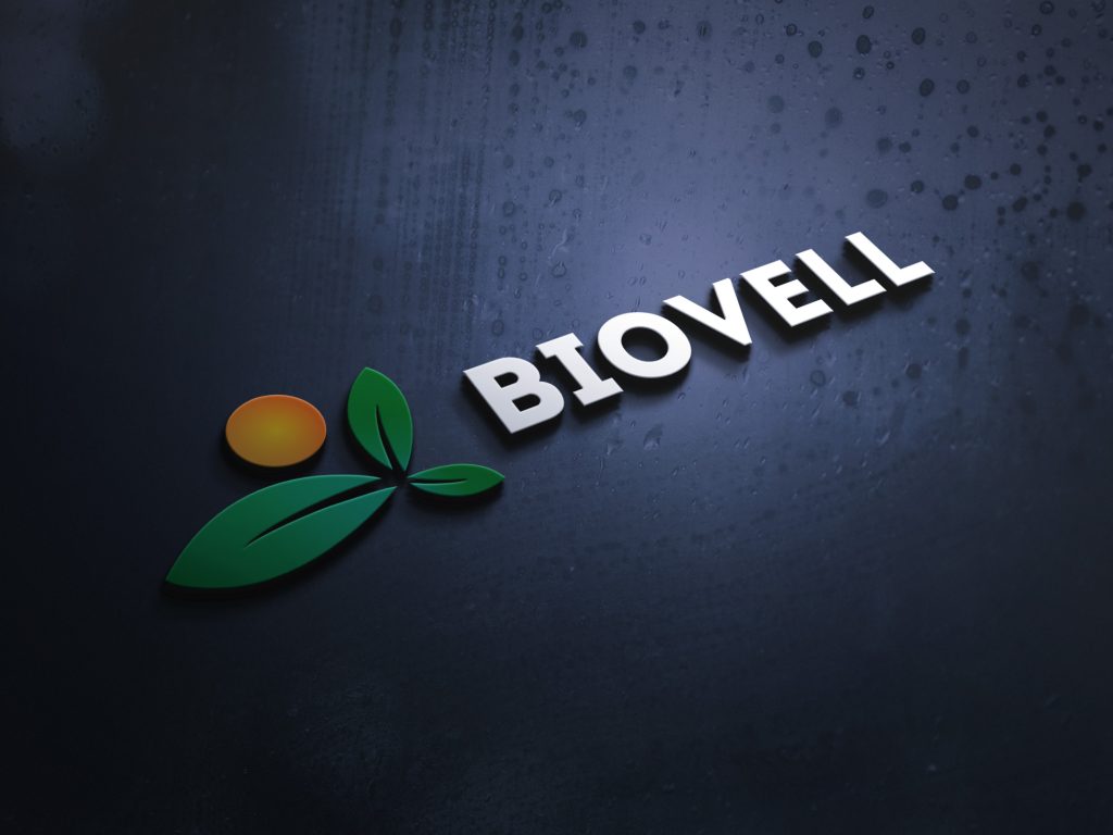
I am excited to present this finished logo design for Biovell. This elegant and thoughtful design encapsulates the brand’s commitment to providing premium health supplements with a modern and natural aesthetic.
Logo Description:
- Typography:
- I have selected a clean, contemporary sans-serif typeface for the word “Biovell.” The font strikes the perfect balance between sophistication and approachability, reflecting the brand’s dedication to high-quality health products that are accessible to everyone.
- The letters are subtly rounded, offering a friendly, organic touch that aligns with the emphasis on natural, wholesome ingredients.
- Iconography:
- The icon combines the symbols of health and vitality with a nod to nature. At the heart of the logo, a stylized leaf with a gentle curve represents natural wellness and growth, while also suggesting energy and life.
- This leaf shape smoothly integrates with a flowing, circular pattern that encircles the company name. This creates a sense of unity and holistic care, mirroring the way the supplements nurture body and mind.
- Color Palette:
- The color palette chosen for the logo is fresh and inviting. A soothing green conveys health, freshness, and natural ingredients, while an earthy beige tone complements it, evoking feelings of warmth and trust.
- The use of these colors enhances the visual appeal and immediately communicates the brand’s focus on natural, health-conscious products.
- Overall Design:
- The design is clean and easily recognizable, making it adaptable to various formats such as packaging, digital media, and signage.
- The harmonious blend of typography, iconography, and colors ensures that the logo will stand out in the competitive health supplement market and establish a strong brand identity for Biovell.
In conclusion, this logo design captures the essence of Biovell as a leader in health supplements. Its modern yet organic feel will resonate with the target audience, conveying the commitment to quality and natural wellness.
